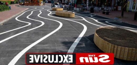
LIVID homeowners have laid into their council for wasting a fortune on painting wiggly white lines on the high street.
The local authority in Worthing, West Sussex, forked out £1,230 on the pedestrian zone paint job – but residents think it's a complete misuse of funds.
Mark and Frida Goulding, who live in the area, described the "continental-style" decorative squiggles as "an utter waste of money".
Mark, 62, said: "I can’t believe they cost so much.
"They’ve paid designers to come up with this when there could have been a much more imaginative way of marking out a pedestrianised zone."
Frida, 72, who is originally from Derby, added: "It’s shocking what this council finds to waste money on.
READ MORE UK NEWS
7 ways ‘killjoy’ councils are RUINING the Jubilee – & their punishments
We’ve been in the WRONG HOUSE for 20 years due to a council paperwork blunder
"It could have gone to pay for two teaching assistants or a food bank or things that were actually useful.
"Frankly, it’s a disgrace."
Another local, Joy Franklin, agreed, adding that the design "looks ridiculous".
"I think the council have made a huge mistake spending all this money on it," she said.
Most read in The Sun
WHAT'S THE SCORE Carroll's 3-in-a bed Dubai girl reveals what really happened in hotel room
Spain holiday warning – Brits face closed restaurants & bars at top resorts
Portugal holiday warning update for Brits heading abroad this summer
Thousands of households have just DAYS left to apply for £150 council tax rebate
"It's a total waste and could have been better spent elsewhere at a time when money is hard to come by.
"And it looks ridiculous in my opinion."
But her friend, Sally McClelland, said it was "a good talking point" as all art should be.
"Public art should cause a conversation and that is exactly what this new design is doing," she added.
"I quite like it because it is prompting a dialogue and that is what it should do."
The white lines are part of a £178,000 development in the seaside town, funded by high street renovation grants from the government.
Adur and Worthing Council spent £23,500 on the design and management of the project, with £1,230 on the lines alone.
It was originally going to be a temporary installation, but was made permanent to offer an "attractive outdoor meeting space".
I think the council have made a huge mistake spending all this money on it.
The unusual pattern has been widely criticised by those living nearby, especially due to the cost.
Joan Brown said: "There are much better things that a large sum of money like that could have been spent on."
But some claim it "makes them happy".
Nathan Lee, whose Bouncy Castle business is temporarily sitting on top of the wiggly lines, thinks the swirly layout is a positive.
"I like it a lot," he said. "Before it was just a road, but now there is a design and they have put in some flower beds which, when the flowers come out, will be very nice.
"There were some disabled parking spaces and they have been moved, but I like the fact it is now totally pedestrianised.
"It is a major improvement from what it was and I like the wiggly lines."
OVER THE LINE
Karen Godfrey, 56, and her sister Anna Challinor, 46, agreed that the design improved the neighbourhood.
Anna said: "The wiggly lines make me happy so I like them.
"They’re light and free and do what they want.
"I think it clearly makes this feel like a pedestrian area rather than for cars which has to be welcomed in the centre of town.
"I don’t know why so many people are moaning about it. People are always so negative."
Karen added: "I’d question the amount of money spent on painting a few white lines on the road, but now there are tables and chairs and people can enjoy a d drink and something to eat al fresco.
"It’s an improvement on what was here before for sure, but whether it is worth in excess of £20,000 I’m not sure."
Colourful plants and shrubs, as well as "decorative" street lighting, accompany the lines, while new seating areas have been installed to "brighten up" the road.
A council spokesperson said: "We wanted to transform Montague Place and provide residents, businesses, shoppers and visitors with an inviting landscaped open space that can be used for a variety of things – whether meeting up with friends for a coffee or something to eat at one of the many excellent eateries, relaxing in the sun or visiting one of the events that will be held over the summer.
"The continental-style painted 'squiggly lines' on the tarmac are inspired by cities like Copenhagen and designed to brighten up the naturally dark tarmac as part of the project that has been funded by central government.
Read More on The Sun
I bought my son an amazing balloon display – I wished I’d known hidden danger
Spain holiday warning – Brits face closed restaurants & bars at top resorts
"The new planters and flowers will really add some colour, while the new lighting and seating areas will make a perfect meeting place that is car-free and more aesthetically pleasing for everyone.
"Initially this is a temporary project and we are preparing an engagement exercise to understand what people want to see in the long term to benefit this wonderful area of the town centre."
Source: Read Full Article


